
Summary
I resurfaced some critical feedback from two previous user research benchmarking studies which found that users struggled to navigate within Virtual Private Cloud (VPC) Infrastructure, which is a set of related microservices with its own navigation menu in the broader IBM Cloud website.
I worked on 3 iterations and rounds of balanced comparison testing to address the navigation issues, then brought it to the design system team, product manager, and UI developers to present the case that the existing pattern was not working well for our particular user base. With this research, I received buy-in from those key stakeholders and was able to get this on our VPC product roadmap.
Impact
60% faster time on task
as measured in the final usability testing study
37% increase in left navigation usage and a 45% decrease in breadcrumb usage over the span of 5 months - a trend indicating that users prefer the full navigation menu over the breadcrumb.

Investigation
The problem
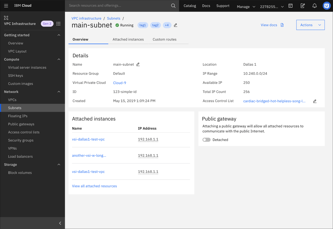
The existing navigation pattern for VPC consists of a list of resources with the main VPC menu on the left. Clicking on the resource name takes you to the resource’s details page, which hides the main navigation menu.
While this navigation pattern generally works for other services in IBM Cloud, it does not for VPC Infrastructure, because it’s instead made up of many related microservices which cloud developers create back-to-back, especially when first setting up their infrastructure.
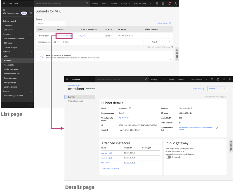
To navigate back from the details page to see the main VPC navigation menu, users can click the breadcrumbs (fewest steps), the IBM Cloud hamburger menu, or their browser back button (not ideal):
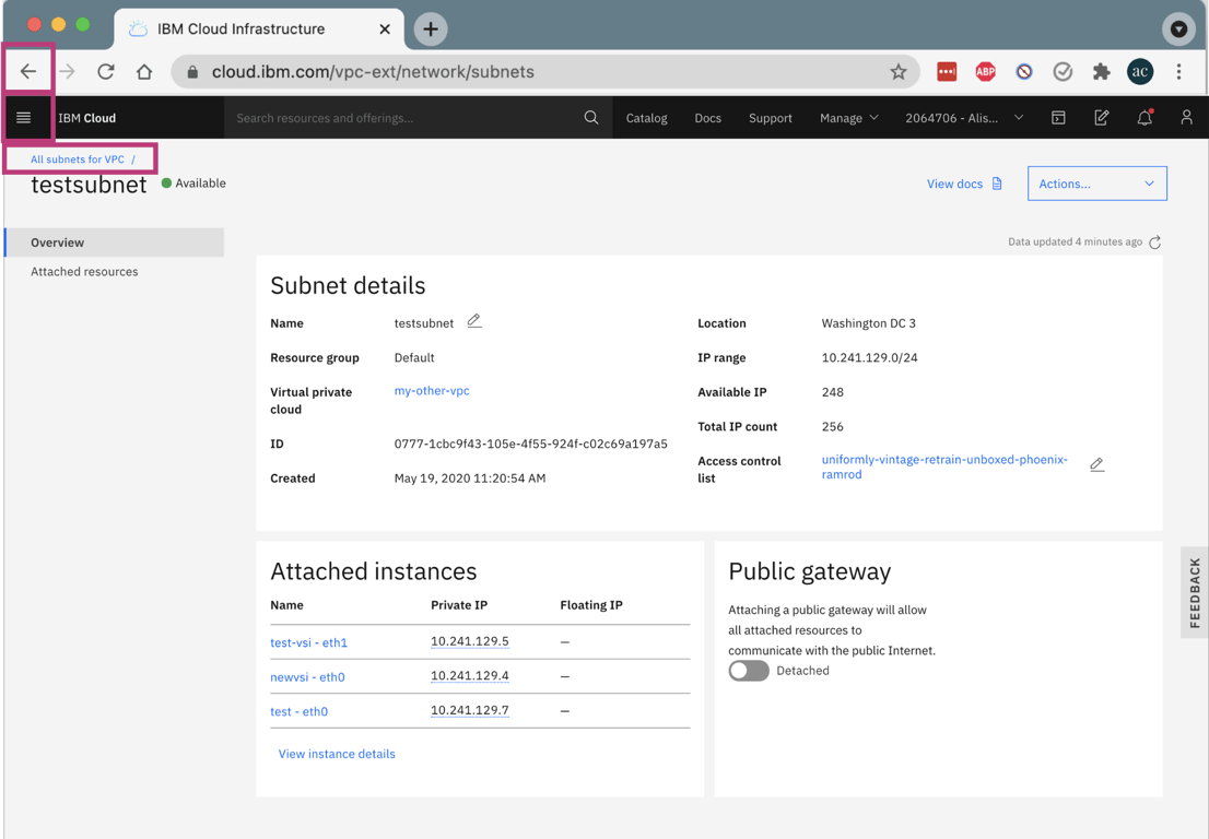
However, using the breadcrumb was not intuitive to some users, and they got lost trying to navigate back to the VPC Infrastructure world.
“I wasn't able to get back to the home dashboard [VPC world nav] after I spun up [VPC resources]. I'm sure there was a way, but I had to use the browser’s back button to get to the main screen to start each successive task. Selecting "Dashboard" took me to a whole different location. […] At this point, I was pretty frustrated.”
– Network Engineer (March 2020 benchmark study)
– Network Engineer (March 2020 benchmark study)
“I just clicked on this ‘All’ link to get back to this [VPC nav] menu. I don’t know why this menu disappeared when I was in the actual editing of the VPC resource.”
– Infrastructure Architect (March 2020 benchmark study)
– Infrastructure Architect (March 2020 benchmark study)
Challenge
How can we streamline navigation within Virtual Private Cloud Infrastructure?
Constraints
- Staying within the Cloud design system’s visual guidance & grid system
- Accounting for the sub-navigation menu when viewing the details of a resource
After explorations & research
- Getting VPC Infrastructure an exception to the navigation pattern across Cloud
- Getting this design-led initiative on the development roadmap
Research & design iterations
I worked with my researcher to conduct some unmoderated balanced comparison tests via usertesting.com to gather data on some different explorations. I also wanted to use this data to make a stronger case when bringing this to the design system team, product manager, and UI developers to get improvements on the roadmap.
To measure the success of each iteration, we primarily measured:
- Time it took to navigate from a details page to a different resource’s list page (a realistic task that many users do when first setting up their infrastructure)
- Which of the three methods users used to complete this task
Iteration 1
For the first test, we did a balanced comparison test between the existing breadcrumbs and the proper breadcrumb structure as laid out by our design system team.
I wanted to test this to know how much of an impact this would make if we just did this minimum (and required) update. This change would not require convincing our design system team or product managers to get it on the roadmap, and was minimal UI development effort.
This resulted in a 20% faster time on task just by improving the breadcrumb hierarchy.
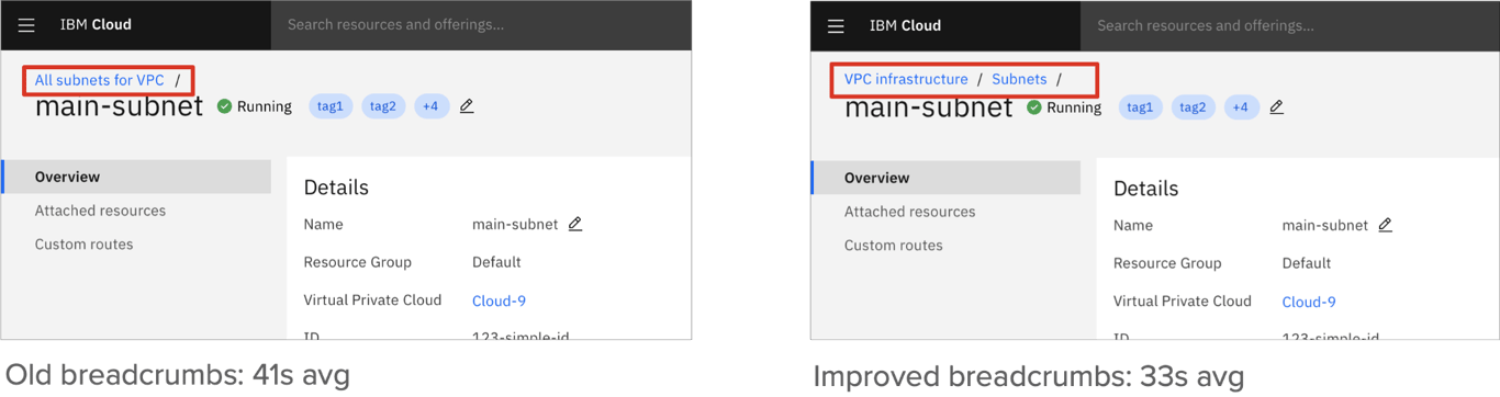
However, 10% of users still used their browser back button and 10% used the hamburger menu, which meant there was still room for improvement.
Iteration 2
For the second balanced comparison test, I explored a “partial persistent nav” so it’s easier for users to know they’re still within VPC Infrastructure. I nested the details page’s sub-navigation under the main VPC infrastructure logo to save space and stay within the existing design system grid.
This persistent partial nav exploration resulted in a 22% faster time on task than just using improved breadcrumbs.
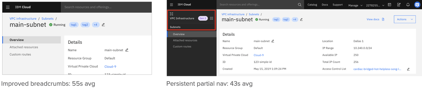
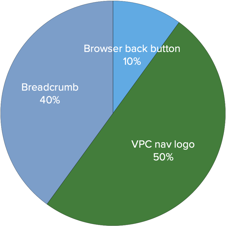
With this design, 50% used the VPC Infrastructure logo to navigate back and 40% used the breadcrumbs. 10% still used the browser back button, which indicated they still had trouble completing this task without a workaround solution.
We also received feedback from a participant who wanted the entire VPC navigation menu to appear on the left because it was much faster to navigate. This led me to do a few more iterations exploring exactly that.
“Why doesn't [the full left nav] show on every page]? It’s kind of annoying to go back to the home by going here [to the breadcrumb] and then going [to the load balancers list from the main nav]. It would be nice if this was always there.”
– Full-stack Developer
– Full-stack Developer
Iteration 3
For this last round of research, I explored some ways to show a persistent navigation menu.
I originally tried to combine the sub-nav menu under the full navigation on the left but thought the hierarchy ultimately did not make sense and would likely be missed.
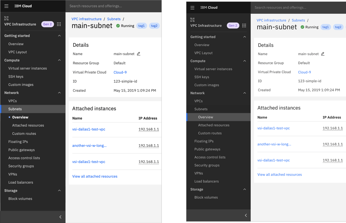
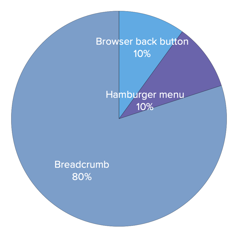
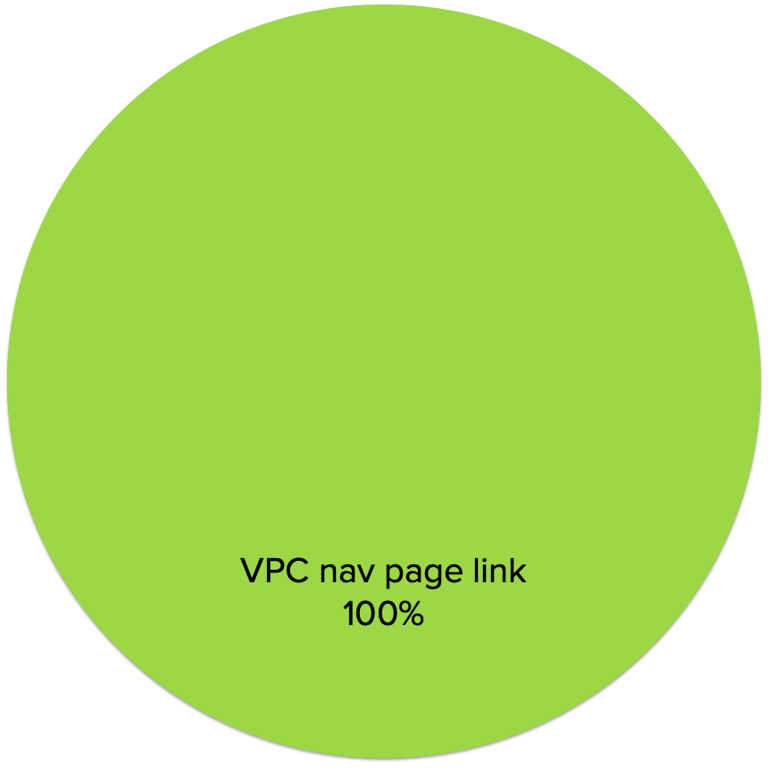
I ended up going with a more brutalist exploration where I simply added the left navigation. I wanted to keep the sub-navigation menu fully visible and vertical for scalability.
This resulted in a 60% faster time on task compared to the old breadcrumbs in the first balanced comparison test, and we found that 100% of participants used the navigation menu to complete the task. This meant it was highly visible and the navigation menu made sense.
Presenting findings
Equipped with all of this data, I presented this research with my researcher to the design system team to get feedback and make the case for VPC Infrastructure to implement the persistent partial navigation.
The team was receptive to the idea but expressed concerns that the main details of the resource would only be 50% of the screen width, which was not very user-friendly.
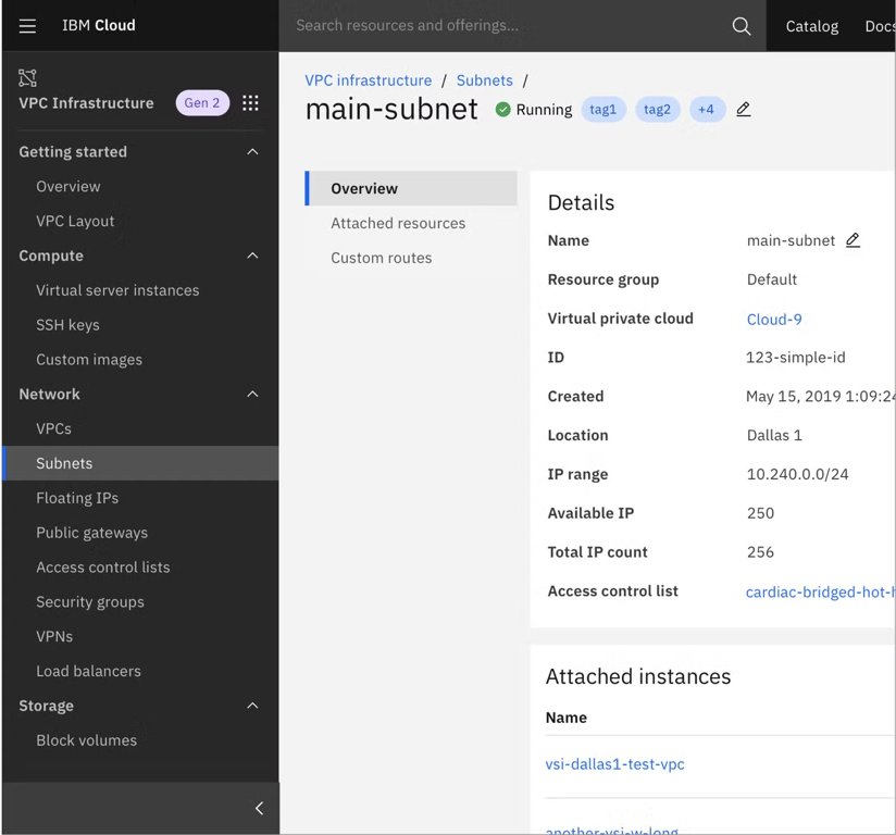
So I did some further explorations with horizontal tabs, and also looked at how this might appear on mobile and desktop views.
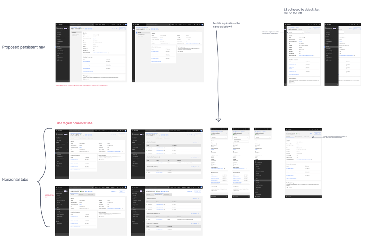
I chose the final iteration with horizontal tabs for the sub-navigation menu. Some limitations with this were scalability and discoverability, as the tabs would start scrolling horizontally at smaller screen widths. However, resources in VPC have only had a maximum of 4 tabs, and based on analytics, 90% of customers use VPC on desktops.
Finally, I took this to our product managers and UI development team, whom I had looped in throughout for preliminary implementation questions.
By presenting these research findings alongside the design proposal I successfully got this design-led initiative onto the roadmap despite our team’s limited resources and packed product timeline.
Implementation & results
This improved navigation experience launched in December 2020.
Between August 2020 and January 2021, we saw a 37% increase in left navigation usage and a 45% decrease in breadcrumb usage - a trend that indicates users prefer the full navigation menu over the breadcrumb.
Another designer reached out to ask how I got this design-led initiative onto the roadmap! This was incredibly difficult to do at the time due to other business priorities.
Hello! Just wanted to pick your brain on how you approached your amazing VPC nav initiative back in 2020. I currently have uncovered a bunch of [project name] pain points from user research […] and I want to learn how you managed a research + design-driven project from conception to GA. Thanks in advance! 😊
–Design Lead for Interconnectivity & Networking
 Made with Bullet