Overview
Upstage Arts is a non-profit community theater company located in Webster, TX. It focuses on training actors in all aspects of theater through full-scale theater productions, and also offers studio classes for voice, acting, and dance.
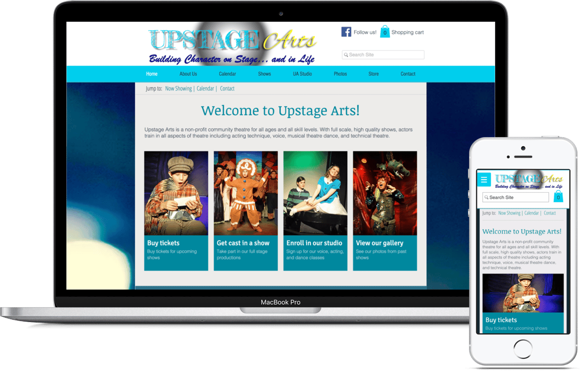
My work with Upstage Arts involved redesigning the website to make it accessible on mobile devices and easier for users to navigate.
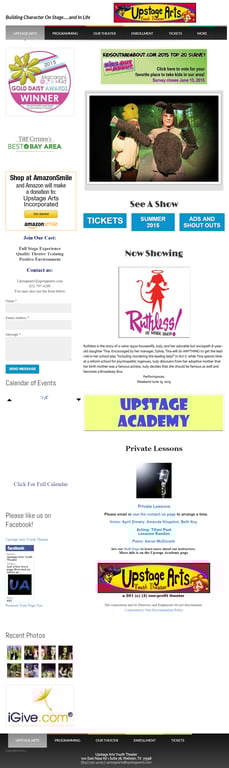
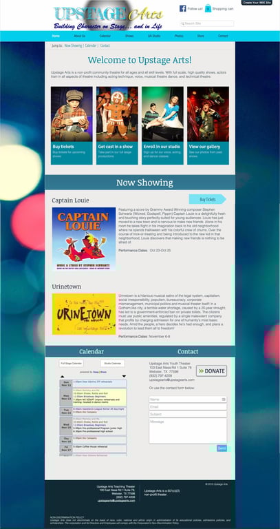
On the left is the old website. The image on the right is the redesigned website. (Click to expand)
Framing the problem
Client
I first met with the client to learn about their business goals and the tools they were using to maintain their website. Their main objective was to update their website’s design to attract more customers.
Users
I also asked who the primary users were as well as their main tasks and pain points when coming to the website. I learned that the primary users are parents enrolling their kids in shows. Parents' main complaints were that the website had too much information on the homepage and it's hard to use on their phones.
Challenge
How can we redesign the Upstage Arts Theater website to meet the client’s business goal of attracting more customers, while making the site more modern, mobile-friendly, and easy for users to navigate?
Research
Choosing a better website builder
I conducted an analysis of the client’s existing website builder and found that it didn’t allow for creating a mobile-friendly website. This was a major drawback since the existing analytics indicated most visitors used the mobile site.
I worked the client to identify the following requirements and evaluate alternative website builders:
I worked the client to identify the following requirements and evaluate alternative website builders:
Is affordable
Has secure e-commerce options
Easy to set up and maintain
Offers a mobile-friendly solution
Offers version history so managers can refer to old pages
Most of my research centered around finding the right website builders with these criteria in mind. I conducted a competitive analysis of potential website builders with e-commerce plans.
Website builder | Price with e-commerce | Mobile friendly option | Customization | Learning curve & set up time | Version history |
Wix | $16/mo | Separate mobile version | Drag & drop anywhere | Low | Yes, with undo/redo |
Weebly | $26/mo | Separate mobile version | Drag & drop with constraints | Low | No |
Squarespace | $18/mo | Responsive website | Drag & drop with constraints | Low | No |
Wordpress.org | $25/mo | Responsive website | Separate editor | High | No |
Wordpress.com | Free | Responsive website | Limited - more for blogging | Medium | No |
Based on the client’s needs, I recommended Wix because it offered the most flexibility and customization at an affordable price. In addition, creating prototypes directly through Wix allowed me to quickly share them with the client.
Content analysis
Before diving into design itself, I created a content inventory of the old website, then worked with the client to reorganize the site navigation and select what content to show on the homepage. This was especially important for the mobile site, which can only display a limited amount of information at a time.
Design & implementation
Iteration 1
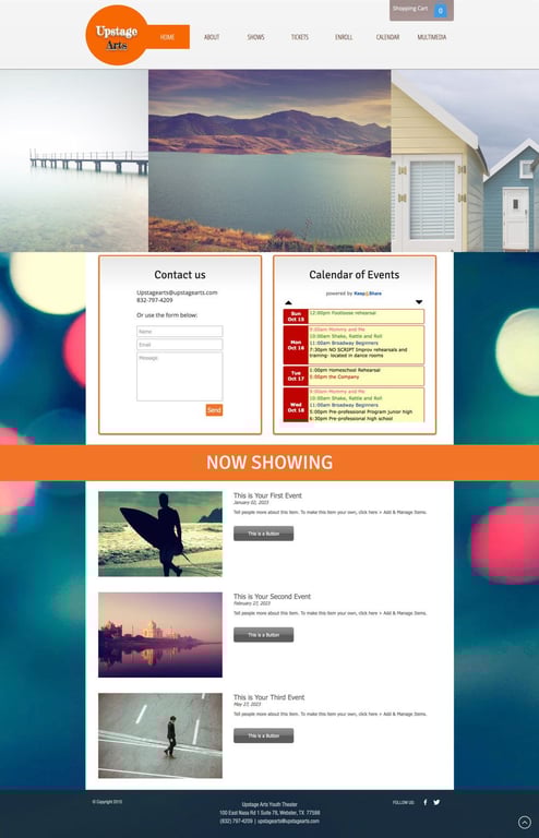
In the first iteration, I showcased Wix’s capabilities to demonstrate to the client that this was a suitable website builder for their needs. In addition, I began focusing on mobile compatibility by stacking content into one main column instead of having information in a sidebar like the old site.
Iteration 2
After getting the client’s approval to move forward with Wix, I created the second iteration based on their content requirements. To help users more easily navigate the site, I also added four call-to-action buttons at the top according to users’ primary tasks.


Iteration 3
Lastly, upon receiving positive feedback from the client, I refined the interface and began adding in actual content.


Throughout the iteration process, I also worked with the client to reorganize website pages into clearer navigation categories and labels to make it easier for users to navigate the site as a whole.
Content writing
One of things I focused on in particular was ensuring language was succinct and easy to understand throughout the site. As an outsider to the theater industry, I realized that certain labels the clients used might be unclear to potential customers who are new to theater. I therefore worked on clarifying labels so that they would make sense to the common user.
Also, I noticed that it wasn’t immediately clear on the old website what Upstage Arts was. To better inform new customers about what they do, I added a short introductory paragraph about the theater company and its main services.
Google Analytics
In addition to redesigning the website, I implemented Google Analytics to help the client collect important data about their site usage, such as:
- Number of new and returning visitors
- What browsers visitors are using
- What kinds of devices most users are using
- User behavior flow on the site
I shared with the client that looking at this data would help them concretely measure website traffic and activity, allowing them to make appropriate adjustments to their website in the future.
Takeaways
Completely redesigning the website was a challenging yet very rewarding experience. Overall, the client was pleased with the outcome and received positive feedback from their customers about the new website.
My biggest takeaway from this project was that UX design is as much about solving the original problem as it is about educating your client and stakeholders along the way about what you're doing and why it's important. Sharing this knowledge can encourage them to take their own steps towards improving their site or product.
 Made with Bullet