Overview
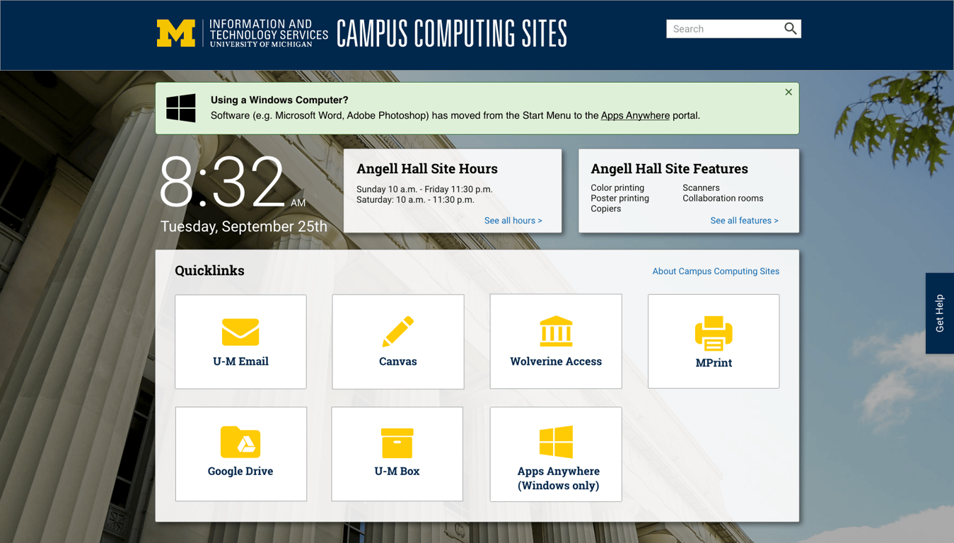
The Information & Technology Services (ITS) Campus Computing Sites (CCS) landing page is the default webpage on University of Michigan (U-M) computers. As the designer on the team, I redesigned the landing page as part of a larger project to revamp the entire CCS website.

Problem statement
Students frequent U-M’s campus computing sites primarily to work on a large desktop computer. As part of the university’s larger effort to improve usability, accessibility, and cohesive branding across all U-M websites, we needed to redesign the landing page shown on these computers to be more relevant for students.
Challenge
How can we redesign the CCS landing page to be simpler and more helpful for students to find the information they need?
Research
The target audience for the landing page is U-M students, as they make up the majority of CCS users. To determine users’ needs and content for the new landing page, we first had to find out how students used the old landing page.
Due to time and resource constraints, we were unable to conduct full user interviews, so we instead combined three types of research:
- 15 quick, two-minute interviews at a high-traffic campus computing site
- Heatmap and analytics data for existing landing page
- A short survey about use of the News & Announcements section
From this research, we determined the most common links students used: U-M Email, Canvas (learning management system), Wolverine Access (student administration gateway), MPrint, Google Drive, and U-M Box.
Based on the survey, we also removed the News & Announcements section at the top as 82% of students interviewed said they hadn’t even noticed it, and the client said they rarely update it.
Design
Design inspiration
After conducting research and analyzing the data, we brainstormed ideas for how to redesign the landing page.
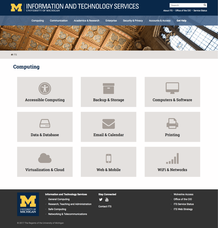
For inspiration, I referenced the main ITS site’s landing page for ideas on how to implement quicklinks and match the ITS website’s visual design standards.
We also considered the new-tab Chrome extension, Momentum, which is popular among U-M students. We decided that implementing its rotating full-screen background image feature in the new landing page would be familiar and visually pleasing for users. For the images, we used photos of famous campus landmarks to add a touch of U-M branding.

Combining both functional and aesthetic elements from these two sources, we created a landing page that would be both enjoyable and useful for students.
Wireframes and mockups
Next, I began designing what the landing page would look like. For the first three iterations, I sketched wireframes with accompanying high-fidelity mockups because wireframes alone wouldn’t effectively convey how the page would look and feel.
Iteration 1
I came up with an initial version with the quicklinks in a card format on top of a fullscreen background image, as informed by the design inspiration mentioned above.
Iteration 2
I then discussed my initial wireframe and mockup with my teammates to get feedback. The result of the discussion was iteration 2.
Main changes from the first iteration:
- Adding the large time and date display for users’ convenience
- Grouping quicklinks into a single box to make them more cohesive
- Adding a link to the main CCS website so users can easily find additional information
Iteration 3
Taking the design that was developed with my team members, I further refined it into iteration 3.
For iteration 3, I thought of an additional feature (“dynamic content boxes”) that displays the hours and features of the current Campus Computing Site that the computer is located in.
The use case might be if a user is logged on to a computer at a particular computing site and is planning to stay there late to study, they might want to know what time the site closes to manage their study session. They may also want to know whether the site they’re in has certain features like color printing.
After proposing this feature to the Web Team developers, we confirmed that it was technically feasible.
Iteration 4
We then showed the high fidelity version of iteration 3 to the client and received positive feedback about the overall design and the dynamic content boxes feature. The client also requested a few additions:
- A Get Help button
- An additional quicklink card for a new application launcher called AppsAnywhere*
- A way to advertise the AppsAnywhere change
*AppsAnywhere is a unified, cloud-based web portal for Windows applications. This means programs such as Microsoft Word appear in a browser window instead of the traditional Start Menu.
To help users adjust to AppsAnywhere, I added a banner at the top to publicize this major change.
The result was iteration 4, which was implemented.
In the end, we successfully launched the redesigned Campus Computing Sites landing page before the start of the fall 2017 semester.
Impact
To measure impact, I compared the average number of clicks per visit using CrazyEgg’s data by dividing the total number of clicks by the total number of visits for each version of the landing page:
New landing page | Old landing page |
6,971 clicks/25,000 visits = 27.8% | 2674 clicks/14,544 visits = 18.3% |
This indicates that people are utilizing the links about 10% more on the new landing page than those on the old landing page.
Takeaways
From this project, I discovered that the design process is not always as straightforward as what I had learned in class.
Ideally, we would’ve conducted 5-7 full user interviews with students. However, because of time and resource constraints, it was much more realistic to do quick interviews combined with quantitative data (heatmap + survey) to get what we needed for the design.
With mockups, it wasn’t appropriate to iterate on designs strictly in low-fidelity before moving to high-fidelity. Due to the nature of this project – simple content with a heavy emphasis on visual design – I found it necessary to move to high-fidelity earlier to better conceptualize the landing page.
Overall, the UX process is a great guideline, but I’ve realized that it’s also important to be able to adapt to real-life constraints as well as to the needs of each project.
